9/29/17 – 10/6/17
All work is due by midnight on 10/6/17
Thanks go out to the Design group for their input this week!
Week 6 will be focused on design. For this week you will be ramping up your command of image editing as well as closely considering design elements such as color, font, iconography, etc. We’ve put together a page that includes lots of great design resources. You should take a look at it.
Note: Many of the design assignments challenge you to design objects like posters, postcards, or book covers. Consider – What makes a poster look like a poster? What makes a book cover look like a book cover? It takes more than just putting words together with a photo. What distinguishes design from decoration?
 Read/Watch and Reflect – Two options:
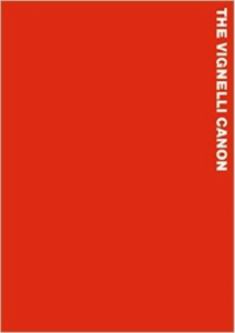
1. A design resource that’s worth looking at is The Vignelli Canon. It’s a short booklet by Massimo Vignelli, who was a superstar in the world of graphic design. The booklet is light on text and heavy on space and imagery, so it’s a quick read. His purpose in writing it was to share his knowledge for the benefit of other designers. As he says, “Creativity needs the support of knowledge to be able to perform at its best.” Vignelli did most of his work in the pre-Internet era, when graphic design meant ink on paper, so some of the information is not so relevant to our online environment, but the principles still stand. So take a look at it and let us know what you think.
OR
 2. Hassan Otsmane-Elhaou has been doing in-depth analyses of design in various manifestations in comic book pages. Design, in a larger sense, is a process of deliberate decision-making to achieve a desired goal. Hassan expertly shows how the design decisions taken by the creators on these pages work to advance the stories. Look at a few of these articles and videos and share your reflections on how design can be used to tell stories.
Strip Panel Naked: Negative Space in ‘Jessica Jones’
Strip Panel Naked: ‘Unstoppable Wasp’ And Dealing With Complicated Layouts
Strip Panel Naked: The Considered Approach of Tamaki & Leon’s ‘Hulk’
Controlling Movement | Black Widow (2016) (Youtube)
Time Signatures in Comics and Film | Watchmen & Sin City (Youtube)
Steve Dillon’s Economic Storytelling (Youtube)
Categorize your reflection post under Thoughts/Ideas and tag it designthoughts.- Complete a DesignBlitz: To reinforce your understanding of design principles, you need to undertake a “Design Blitz.” Carry your camera with you this week and take photos of objects, ads, signs, etc. that illustrate at least four of the ten concepts listed below (one photo per concept). Refer to the DesignBlitz resources on the Design Resource page for more information about each of the concepts.
- color
- typography
- metaphors/symbols
- minimalism & use of space
- form/function/message
- balance
- rhythm
- proportion
- dominance
- unity
- Share all your photos on Flickr and tag them designblitz; also make sure you write up a blog post sharing what you found and tag it designblitz.
- When you have completed your Blitz, write a blog post that includes (THAT MEANS EMBED!) the photos and your analysis of the design elements and what makes them effective or not. (You should do this in one single post.)
- PRO TIP: Sometimes we can learn just as much from badly designed things as we can from well-designed things!
- Do your DailyCreates: We are doing 3 TDCs again this week.
- Do one of these three:
Super tattoo
From screen to page
Superhero makeover - Complete at least 10 stars of other design assignments: Complete at least 10 stars of Design assignments from the Design category of the Assignment Bank. Make at least two of the assignments related to your character in some way. A couple of design assignments we recommend are the Four Icons/ One Story and the Minimalist Movie/TV Poster assignments, though neither is required. Each design assignment must be blogged and narrated with your process and thinking! Don’t forget to review Alan’s tips of how to write-up assignments like a pro – it’s all in the write-up.
