2/15/19 – 2/22/19
All work is due by midnight on 2/22/19

by Diggle, Casalanguida, Blythe and Bowland, from Kill Chain
Week 6 will be focused on design. For this week you will be ramping up your command of image editing as well as closely considering design elements such as color, font, iconography, etc. We’ve put together a page that includes lots of great design resources. You should take a look at it.
Questions of the week: Many of the design assignments challenge you to design objects like posters, postcards, or book covers. Consider – What makes a poster look like a poster? What makes a book cover look like a book cover? It takes more than just putting words together with a photo. What distinguishes design from decoration? How does your work this week build on what you did in the previous weeks? How does design build on photography? How do design principles or elements of design apply to audio production? To video production? That’s a lot of questions, so you may not want to address them all. Incorporate your responses in with the next section (designthoughts).
Read and Reflect:
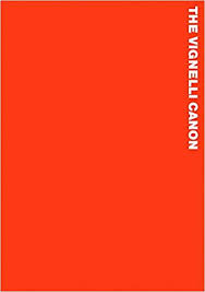
 A design resource that’s worth looking at is The Vignelli Canon. It’s a short booklet by Massimo Vignelli, who was a superstar in the world of graphic design. The booklet is light on text and heavy on space and imagery, so it’s a quick read. His purpose in writing it was to share his knowledge for the benefit of other designers. As he says, “Creativity needs the support of knowledge to be able to perform at its best.” Vignelli did most of his work in the pre-Internet era, when graphic design meant ink on paper, so some of the information is not so relevant to our online environment, but the principles still stand.
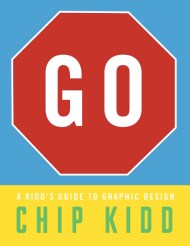
 Instead of writing for designers, designer Chip Kidd wrote a book on design for children. Read this Brain Pickings article about Kidd and his book and follow a few of the links to further design related articles. (Brain Pickings is great for sending interested people down rabbit holes. Also a great example of the power of the hyperlink in digital storytelling.) Write a reflection on what you learn about design from these articles and tag it designthoughts.
Complete a DesignBlitz: To reinforce your understanding of design principles, you need to undertake a “Design Blitz.” Carry your camera with you this week and take photos of objects, ads, signs, etc. that illustrate at least four of the ten concepts listed below (one photo per concept). Refer to the DesignBlitz resources on the Design Resource page for more information about each of the concepts.
-
- color
- typography
- metaphors/symbols
- minimalism & use of space
- form/function/message
- balance
- rhythm
- proportion
- dominance
- unity
- Share all your photos on Instagram and tag them designblitz; also make sure you write up a blog post sharing what you found and tag it designblitz.
- When you have completed your Blitz, write a blog post that includes (THAT MEANS EMBED!) the photos and your analysis of the design elements and what makes them effective or not. (You should do this in one single post.)
- PRO TIP: Sometimes we can learn just as much from badly designed things as we can from well-designed things!
Do your DailyCreates: We are doing 4 TDCs this week.
Complete at least 12 stars of other design assignments: Complete at least 12 stars of Design assignments from the Design category of the Assignment Bank. Make at least two of the assignments related to your character in some way. The Minimalist Movie/TV Poster assignment is a fun one, but not required. Each design assignment must be blogged and narrated with your process and thinking! Don’t forget to review Alan’s tips of how to write-up assignments like a pro – it’s all in the write-up.
Commenting: Of course.
